TYPOGRAPHY - EXERCISES

29.08.18 - 03.10.18 (Week 1- Week 6)
Catherine Starlie (0336261)
Typography
Exercises
LECTURES
Lecture 1: Introduction to The Module
29.08.18 (Week 1)
I didn't come to this class because my visa had just accepted but I knew that we needed to buy graph papers (A4), calligraphy pen (Artline 3.0), and print some type family such as Blackletter, Uncial, and Rounded Hand.
Lecture 2: The Evolution of Typography
05.09.18 (Week 2)
This week's class was to know the typography which had evolved over 500 years. Basicly, typography can describe letterforms and typefaces.
Typography: Basic / Describing Letterforms
Baseline: The imaginary line the visual base of the letterforms.
Median: The imaginary line defining the x-height of the letterforms.
X-height: The height in any typeface of the lowercase 'x'.
 |
| Example of Baseline, Median, X-height |
We often write the capital letters bigger than or same with the letter that has ascender height, but we are wrong because it makes the capital letters look bigger or giant.
In fact, the larger the x-height, it determine the font that we design more readable. Usually, we liked to use font to type documents, stories, or everything. And the font that we used can determine the contrast of a letter because it's important for readability. Some fonts that we used:
1. Georgia : for screen use (reading), not for print.
2. Helvetica : less contrast
3. Times New Roman: more contrast
And here are some examples of terms that have been used:
 |
| Example of Some Terms with Meaning |
 |
| Example of Some Terms |
Other than that, there are different typefaces that consist more than 26 letters to numerals and a few punctuation marks.
About letters:
1. Uppercase: capital letters including accented vowels, cedilla, tilde, and ligatures.
Lowercase: including the same characters as uppercase.
Reference List: https://www.researchgate.net/figure/Set-of-uppercase-and-lowercase-English-letters-used-as-test-images-the-size-of-each-is_fig3_220501628
About letters:
1. Uppercase: capital letters including accented vowels, cedilla, tilde, and ligatures.
Lowercase: including the same characters as uppercase.
 |
| Example of Uppercase and Lowercase Letters |
2. Small Capitals: Uppercase letterforms which drawn to the x-height of the typeface.
 |
| Example of Small Caps |
3. Uppercase Numerals: have the same height as uppercase letters.
Lowercase Numerals: set to x-height with ascenders and descenders.
 |
| Example of Uppercase and Lowercase Numerals |
4. Italic: The forms refer back to fifteenth century Italian cursive handwriting. But the small caps are almost always only roman. Oblique are typically based on the roman form of the typeface.
 |
| Example of Italic |
5. Punctuation, miscellaneous characters: contain standard punctuation marks while the miscellaneous characters can change from typeface to typeface.
 |
| Example of Punctuation, Miscellaneous Characters |
6. Ornaments: Used as flourishes in invitations or certificates.
 |
| Example of Ornaments |
About typefaces:
 |
| Description of Roman, Italic, Light, Condensed, Boldface, and Extended |
Comparing Typefaces:
Typefaces are mean to be easy readability and an appropriate expression of contemporary esthetics. Those typefaces have surpassed the latter goal and remained in used for decades.
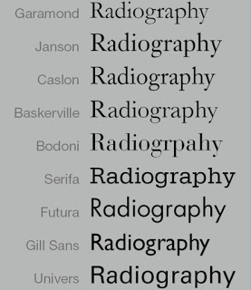 |
| The Evolution of Typefaces |
12.09.18 (Week 3)
No lecture today and we move to our next assignment.
Lecture 4: Development / Timeline
19.09.18 (Week 4)
We learnt about the development of typography which was originally from western. They used to write by scratching into wet clay with sharpened stick or carving into stone with a chisel. The forms of uppercase letterforms have evolved out of these tools and materials. As the uppercase forms are simple combination between straight lines and piece of circles.


Left: The evolution of Phoenician letter. Right: the 11th century BCE, the oldest piece of Phoenician writing from the Phoenician city of Byblos (today in Lebanon).
Reference List: https://study.com/academy/lesson/phoenician-alphabet-definition-history-importance.html
But then, the Greeks changed the direction of writing. Even though the Phoenician wrote from right to left, the Greeks developed a writing style called "boustrophedon" (how the ox ploughs) which meant it read alternately from right to left and left to right. If they change the direction of reading, they also changed the orientation of the letterforms.
 |
| An example of boustrophedon |
At the 4th or 5th century, there was a hand script called square capitals, and at the later 3rd-mid 4th century, there was a hand script named rustic capitals.

Reference List: http://luc.devroye.org/fonts-78484.html http://www.writeopinions.com/rustic-capitals
After that, we learnt about Blackletter to Gutenberg's type. Gutenberg's skills included engineering, metalsmithing, and chemistry. He then marshaled them and accurately mimicked the work of the scribe's hand (Blackletter). But his type had a different bass matrix, or negative impression, for each letterform.

 |
| the 1st one is Square Capitals the 2nd one is Rustic Capitals |
After that, we learnt about Blackletter to Gutenberg's type. Gutenberg's skills included engineering, metalsmithing, and chemistry. He then marshaled them and accurately mimicked the work of the scribe's hand (Blackletter). But his type had a different bass matrix, or negative impression, for each letterform.
Lecture 5: -
26.09.18 (Week 5)
No lecture for today, but Mr. Shamsul taught us how to animate the lettering.
Lecture 6: -
03.10.18 (Week 6)
No lecture for today, but Mr. Vinod taught us about the next project.
INSTRUCTIONS
Calligraphy (Week 1- Week 4)
Since I was late and I heard some assignments from friends. I was told to buy Calligraphy pen and Graph paper to make horizontal, vertical, and circular strokes. And this assignment is to see our consistent in our strokes.
 |
| Fig 1.1 First attempt with horizontal, vertical, and circular strokes |
 |
| Fig 1.2.1 Second attempt with horizontal strokes |
 |
| Fig 1.2.2 Second attempt with vertical strokes |
 |
| Fig 1.2.3 Second attempt with circular strokes |
 |
| Fig 1.3.1 Third attempt with circular strokes |
 |
| Fig 1.3.2 Third attempt with horizontal and circular strokes |
 |
| Fig 1.4 Final attempt with horizontal, vertical, and circular strokes. |
 |
| Fig 1.5 Chosen hand: Uncial |
 |
| Fig 1.6.1 First attempt of Uncial |
 |
| Fig 1.6.2 First attempt of Uncial |
 |
| Fig 1.7 Second (Final) attempt of Uncial |
 |
| Fig 1.8.1 Attempts on the quote to calculate how long for each line |
 |
| Fig 1.8.2 Attempts on the centre on graph paper |
 |
| Fig 1.8.3 Attempts on plain A4 paper |
 |
| Fig 1.8.4 Attempts on plain A4 paper |
 |
| Fig 1.8.5 Attempt on plain A4 paper |
 |
| Fig 1.8.6 Another attempt on plain A4 paper |
 |
| Fig 1.8.7 Another attempt on plain A4 paper |
 |
| Fig 1.8.8 Latest attempt on plain A4 paper |
Animated Lettering (Week 4 - 5)
It's not the final one thought. But after this, we were told to make an animated lettering that express ourselves. And I choose "messy" to resemble myself.
 |
| Fig 2.1 First attempt - (messy) |
 |
| Fig 2.2 Second attempt - (messy) |
 |
| Fig 2.3.1 First attempt of the animation lettering - (messy) |
 |
| Fig 2.3.2 First attempt of the animation lettering - (messy) |
 |
| Fig 2.4.1 First outcome - (messy) |
 |
| Fig 2.3.3 Second attempt of the animation lettering - (messy) |
 |
| Fig 2.4.2 Second attempt of the animation lettering - (messy) |
 |
| Fig 2.4.3 Final attempt of the animation lettering - (messy) |
I still need to fix it but we also proceed to our next assignment.
For this exercise, we need to make it in 80X80 mm squares, with a 7mm vertical and 20mm horizontal gap on A4 size document.
 |
| Fig 3.1.1 First outcome |
 |
| Fig 3.1.2 Second outcome |
 |
| Fig 3.1.3 Third outcome of Type Expression |
 |
| Fig 3.1.4 Final outcome of Type Expression |
 |
| Fig 3.2.1 First outcome |
 |
| Fig 3.2.2 Second outcome |
 |
| Fig 3.2.3 Final outcome |
FEEDBACK
Week 2
Specific feedback: Mr. Vinod said that the lines are not long and straight enough. Then, the gap between each lines should be the same with the pen nib. And also, the circular strokes must touch every edges. He said that I needed to redo it because it could make me more consistent.
Week 3
Specific feedback: Mr. Shamsul said that the a, b, and h must have the same x-height, the letter h ascender is too high, b is too bigger, d is wrong, and e is narrow and not rounded. Meanwhile the letter p and q are kinda rush and not really straight. As for the quote, the spacing between words are too close but the x-height is okay enough.
Week 4
General feedback: we were told to update the feedback after we got it, and had been recommended to read book each week so that we know more about typography from many sources, not just from the lecturer.
Specific feedback: Mr.Vinod said that the letter a-z is okay. As for the quote, the x-height is unstable, spacing is too close, and the letter L is wrong. But after all, the quote is okay enough. For the lettering, it is too thin, and it can be made more messy and added more smudge.
Week 5
Special feedback: I showed my gif and Mr. Vinod said if I wanted to resemble "messy", the one should be moved was the smudge. While Mr. Shamsul said that it's only jiggle and it's not resemble "messy".
Week 6
General feedback: We were told to always update our e-portfolio and to set our blogs into public.
Specific feedback: Mr. Shamsul said that my gif isn't clear. While for the other 6 boxes, Mr. Vinod and Mr. Shamsul said that I should make the "rage" and "heavy" bigger. Mr.Vinod also said that I should have the letter T and l bigger for the "tall", while lighter color for the blur, and as for the "float", the water should be consistent and tried using 0.5 (stroke) and/or I could use grey. Meanwhile Mr. Shamsul said that the "tall" was okay, and as for the "float", the line was to thick and try to make it bigger. As for the "heavy" gif, he said that I should make the letter H slower so that it won't seem break the other letters.
Week 7
Specific feedback: Mr. Vinod and Mr. Shamsul said that my "Sparkle" has too many obstacles around it.
Week 8
Specific feedback: For the name animation, Mr. Shamsul suggested that I made it one by one (the smudge) instead of doing it moved together.
REFLECTION
EXPERIENCES
Week 2
I experienced using the calligraphy pen and learned that we don't need to be fast with our strokes. It's kinda amazing when I saw the lecturer gave us a real example for us. And then I realized that mine is totally a mess and I needed to redo it. It's kinda tired tho but yet it's satisfied myself when I redo it.
Week 3
It's kinda hard to choose which font that we're going to used and I still needed to practice a lot. And I'm also confused for the lettering because it's needed to express ourselves, so yeah.. It's kinda hard for me.
Week 4
My lettering isn't express the word of "messy" enough even tho it's scattered already.
Week 5
Now, I know how people do animation but it isn't easy and it's need time.
Week 6
Taking more time to make my lettering animation.
OBSERVATIONS
Week 2
I noticed that we needed to be consistent with the angle of the pen too and the thickness was depends by our pressure when using it.
Week 3
I noticed that there're so many types of lettering that can express people.
Week 4
I notice that it isn't only me who stuck and tried many things for the lettering.
Week 5
I noticed that there are some interesting and creativity artworks of my classmates.
Week 6
I noticed that some works that we waste time on with mostly turn into failure.
FINDINGS
Week 2
I found out that we don't need to be fast and press the pen too hard. And seeing other's work made me realized to practice harder.
Week 3
I found that there're some people who choose to use Blackletter font and it's kinda surprised me because I thought that it's very hard.
Week 4
I found out that to master a thing or a certain font, it took a long time and our determination to master it. And I also tried a new calligraphy pen and I felt that it's worse than the old one.
Week 5
I found out that we mustn't put more things that resembles ourselves.
Week 6
I found out that we must walk around so that we get more ideas.
Further Readings:
Stop stealing sheep & find out how type works by Erik Spiekermann & E.M. Ginger (Second Edition)
 |
| The Book Cover (Send Edition) |
The artistry comes in offering the information in such a way that a reader doesn't get sidetracked into thinking about the fact that someone had to carefully prepare every line,paragraph, and column into structured pages. Meanwhile, design has to be invisible, and typefaces used for these handworking tasks are therefore by definition "invisible".They have to look so normal that you don't even notice you're reading them. And that's why exactly why designing type is such an obscure profession.
Reference List: Spiekermann, E., M. Ginger, E. (2003). Stop stealing sheep & find out how type works. Berkeley, Calif. : Adobe Press.
Exploring Typography by Nova Rabinowitz Deer (Second Edition)
 |
| The Book Cover (Second Edition) |
Reference List: Rabinowitz Deer, T. (2016). Exploring Typography. Boston, MA: Cengage Learning, 154-155.
Typographic Design: Form and Communication by Rob Carter, Ben Day, and Philip Meggs (Fourth Edition)
 |
| The Book Cover (Fourth Edition) |
 |
| Example of Hierarchical which using typographic rules |
Reference List: Carter, R., Day, B., Meggs, P. (2007). Typographic Design: Form and Communication. Hoboken, N.J. : Wiley, 53.

Comments
Post a Comment