DESIGN PRINCIPLES - EXERCISES & PROJECTS

27.08.18 - 29.11.18 (Week 1 - Week 14)
Catherine Starlie (0336261)
Design Principles
Exercises & Projects
LECTURES
Week 1: Contrast
I didn't come this week but let me give a fast explanation about contrast. Contrast is an arrangement of opposite elements whether it's shape, color, and so on.
 |
| Different types of contrast |
 |
| Contrast in color |
 |
| Contrast in color, size, & proximity |
After that, Miss Sherry asked us to do a drawing about contrast, presented it and given us a feedback. But I couldn't present it since I'm missing her's lessons.
This is my first attempt of my contrast. It's based on my own idea which people like to have different expressions and each person is different.
 |
| 1st attempt according to my art style |
Feedback: Miss Sherry said this isn't contrast because the "black" doesn't strong enough except the flower above.
So, I made a new one which is based on my own idea too. The white part is where people (baby) is born to the world and everyone is happy with it's existence. Meanwhile, the black part is where people die and fall into hell where evils are laughing at us.
 |
| The rough sketch |
 |
| Final attempt of Contrast |
Feedback: Miss Sherry said that this is contrast and is quiet fun to see.
Week 2: The Gestalt Principle
I also missed this class due to the timetable, so here's the short explanation of it. The Gestalt Principle is known as the principle of grouping or a unified whole. It involves both the positive and negative spaces. It is also mentioned in the theories of visual perception developed by German psychologists in the 1920s. It describes how people usually organize visual elements into groups or unified wholes when specific principles are used.
There are also different types of gestalt which are: figure-ground, closure, similarity, continuation, and proximity.
 |
| Example of Gestalt |


And it became like this
 |
| 1st attempt on Gestalt |
Feedback: Miss Sherry said that it's simple enough but my cutting is horrible since I'm using a cutter and cheap scissor. So maybe I could get a new scissor. And she said that maybe I could add a line so it could become more obvious.
So, here is the gestalt that I fixed.
 |
| Final attempt on Gestalt |
Feedback: Miss Sherry said the cutting is better than before and it's nice with the line.
Week 3: Symmetry, Asymmetry, Balance, and Dominance
Starting from this week, the lectures are being presented by groups with different topic, and this week's topic was symmetry, asymmetry, balance, and dominance.
Symmetry: the same way on both sides of an axis. It's divided into 3 which are reflection (mirror), rotational (rotate around common central), translation (repeated and place).
Asymmetry: lack of equality, symmetry, different (more active not passive).
 |
| Difference between symmetry and asymmetry |
Balance: the distribution of visual weight of objects,colors, textures, and space in a composition.
 |
| Example of Balance. It's one of Sue Wookey's art |
Dominance / Emphasis: one with the greatest visual weight (colors, size, or composition that stand out than the other). It's similar with the contrast but different.
 |
| Example of Dominance |
 |
| Rough sketch |
 |
| Final attempt |
Feedback: Miss Sherry said that "black" was kinda hard to use, while with all of the "red" was quiet messy looked violent. It's quiet centred but more into asymmetrical since it made the figures some movement. (So I think I'd mistaken between dominance and asymmetry?) while Aaron said that it could be nicer if I draw or color the line.
Week 4: Pattern, Repetition, Texture, Surface
This week, the second group presented about pattern, repetition, texture, and surface.
Pattern: repeat of an object / symbol. Divided into 4 which are flow, branching, spiral, and packing and cracking.


 |
| Example of Flow(like a water flow), Branching(like a plant), Spiral, and Packing & Cracking |
 |
| Example of Repetition |
 |
| Example of Texture |
Surface: the outer or uppermost layer of physical object. It's 2D but we know what it made from.
 |
| Example of Surface |


Feedback: Aaron said that I was clever to use the gestalt cutout and make it into pattern (leaf) while Ms. Sherry said that it was too full on the middle but not with the other (beside middle I mean). and for the last one, Aaron said it's a pattern and Ms. Sherry said that the colours are bright.
Week 5: Alignment, Hierarchy, Placement, (Visual) Direction
Alignment: the arrangement of the visual elements, divided into: edge, centre, and visual / optical.
Hierarchy: the arrangement of visual elements in a way that implies importance, divided into: proximity, white space, scale, and color and contrast.
Placement: the change and positions of shapes or objects.
Alignment: the arrangement of the visual elements, divided into: edge, centre, and visual / optical.
 |
| Example of Visual Alignment |
 |
| Example of Edge and Centre Alignment |
 |
| Example and Meaning of Hierarchy by Jordan Prindle |
 |
| Example of Placement, featuring Starry Night by Vincent van Gogh |
I used 2 magazines to make this.

Week 6: Dot, Line, Size, Scale
Dot: Smallest and fundamental element in graphic design, usually design it with dots create a wide variety of visual effects. And there are different ways to position it such as:
- A single dot which show calmness.
 |
| A dot at centre |
- A dot at the edge which show tension.
 |
| A dot at edge |
- Repetition
 |
| Example of Repetition |
- Relation between two dots or more
 |
| Example of relations between two dots |
Line: divided into straight, curvy, and simple line art.
- Straight line can help us drawing perspective.
 |
| Example of straight line |
 |
| Example of curvy line |
- Simple line art: by using minimal line to create a drawing.
 |
| Example of simple line art |
Size: big or small an element is in relation to the other object, convey importance, attract attention and create contrast, and a relationship of an area occupied by a shape to another.
 |
| Example of Size named Curiosity by Jeff Jordan |
 |
| Example of Scale by Chuck Close |
I decided to use line, whether it's simple line art or line.
 |
| Sketch of the first attempt using simple line art |
 |
| Simple line art using marker |
 |
| Sketch of lines |
 |
| Lines by using pen |
And so, I fixed my first line.
 |
| Final simple line art by using marker |
Harmony can be described as sameness or belonging with another. Divided into two, which are:
- Visual Harmony: an artwork unified by colour, shape, composition, or other visual design principle.
 |
| Example of Visual Harmony |
 |
| Example of Conceptual Harmony |
1. repetition of design elements (like colour, texture, and so on),
2. through repetition and rhythm,
3. right amount of unity and variety.
 |
| More Example of Harmony by Sergei Sonera |
Movement: makes the audience's eye takes through the work of art to focus of areas. Movement can be directed along lines, edges, shape, and colour within the work. Divided into two:
- Movement through action: creates life and activity within the composition, indicated as "freeze theme" effect of an object.
- Movement in repetition and rhythm: using repetition of elements to create rhythm, and repetition tend to tie things together which make eye wander around the picture.
- Movement through action: creates life and activity within the composition, indicated as "freeze theme" effect of an object.
 |
| Example of Movement through Action by The Caribbean Artist Movement |
 |
| Starry Night by Vincent Van Gogh |
- Regular rhythm: occurs when intervals between elements are similar in size or length, like repetition.
 |
| Example of Regular Rhythm |
 |
| Example of Progressive Rhythm by Marcel Duchamp |
 |
| Example of Alternating Rhythm |
 |
| Example of Random Rhythm by Rene Magritte |
 |
Feedback: Ms. Sherry and some of my classmates said that this is movement because we can look by the fuzzy (blurry) at the hammer, and there're also some rhythm at the back.


PROJECT 2: A SENSE OF A PLACE
Some pictures that I took such as road:


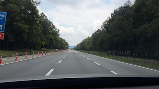
And took this picture when I'm walking around at Sunway Pyramid and there're some events this weekend such as LoL tournament, Dell with a little Pacman tournament and FujiFilm because they launched their new product.


Took this one when I'm walking around the 1st and 2nd floor which looked like an exhibition or gallery for me. Not using the close up photos because it's people photograph not mine.
 While this one was taken when I'm going down by using the elevator.
I'm not really good at edit stuff but giving my effort into it! (YAY :'D)
Feedback: Ms. Sherry said that it's not terrible but it also isn't really excited to look at it too. There're also some pattern there of photos.
Week 9: Proximity, Perspective, Proportion, Unity, Variety
Proximity: grouping and shaping of objects in a composition, and objects near each other are seem as a unit. It also can create and dispel connections. We can apply proximity in design by moving visual elements closer together or further apart, it also can be applied in various degrees to help achieve an outcome.
By making a good sense of proximity in design, we can help differentiate visual elements to reduce visual clutter or make it more comprehensible. The main purpose of it is to organise information. It's the relationship or lack of relationship between shapes.
Perspective: most artists use it to represent three dimensional objects on a two dimensional surface to make it more natural or realistic. It can create an illusion of space and depth on a flat surface.
There are several different types of it depends on the number of vanishing points:
- Atmospheric Perspective: refers to colors and our sense of detail like when an object in a distance and like some objects which also can lose details and sharpness in relative proportion to distance.
- Linear Perspective: uses an geometric system consisting of a line at eye level, vanishing points and lines that converge the vanishing points to create illusion. There are 3 types of it which are one point, two point and three point.
Proportion: the harmonious relationship between 2 or more elements that are put together in a composition so that all elements work together and no one takes over. The effective use of it in design is often referred to as harmony, relationship of various elements of the composition. It also can help to create unity in a design.
Usually people create proportion by using golden ratio (mathematical method for determining proportion) or face proportion. We can know which art has good proportion by seeing if the art has added harmony, symmetry, or balance among of it. And it also can make people respond emotionally.
Unity / Variety
Unity creates a sense of harmony and wholeness by using similar elements within the composition and placing them in a way that brings them together while variety adds interest by using contrasting elements within the composition.
Unity divide into simplicity (reducing amount of potential variety), repetition (guarantee a feeling of unity), and proximity (closeness of different components).
Variety: design principle that embraces diversity of structure, rules, look and feel.
I made this by using ibisPaint X on my phone. Since I'm not usually drawn dark places or dark lightning, I tried to challenged myself. And because it still had halloween theme around here, I decided to draw something thrill.
Feedback: Ms. Sherry said that the words aren't really matched with the perspective that I made.
FINAL PROJECT: BILLBOARD STUDY
The usually advertisement that I saw was at DK lift.
It was about grab tho, and the other one that catches my eyes was about parenting / kids. Which also reminded me back then when I was a kid, I always passed a large smoking billboard which on the same road with my father's shop. The billboard got a man smoking and the smoke shaped a skull and then below it there's a white box with black border and words talking about the effects of the smoking.
I sketched the most important part which are affected by smoking. I chose skin cancer, lung cancer, heart disease, kidney cancer, pancreas cancer, discoloured fingers, stomach ulcer, burger's disease, psoriasis.
I chose to add some more like cataract, hearing loss, hair loss, and winkling.
Feedback: I tried to ask feedback from some friends, Maydeline said that maybe I could add tobaccos at the background while Andrea said that maybe I could use green or blue color for the background. Then, Ms. Sherry said that I could colour either the body or the background.
Feedback: Ms. Sherry said that I did a great job of the organ there.

While this one was taken when I'm having a photo session with my class, and I took this at the Romance Bay at my hometown, picked this because thought it's represented harmony.
Feedback: Ms. Sherry and some classmates said that it's harmony because we can see repetition there and it has a nice view.
PROJECT 1: SELF-PORTRAIT
I used a photo which was taken by my sister. We were at there first to go see the arts and lights which was at southville city. But this photo that I used is like some backplace of the mall.
And I'm also using some washi tapes (or you can say as decoration tape).
Feedback: Ms. Sherry said that it's looked like me but I'm leaving much space below so maybe I can add something or anything. And those objects behind me aren't detailed like how I drawn myself. So gonna add somethinggg.
Week 8: Shape, Form, Figure, and Ground
Shapes: 2 dimensional that we can't touch and basically it's like lines, colors, and so on. And there are three main geometric shape which are square, triangle, and circle.
Shapes have it's abstract part too and there are objective abstract (from realistic objects) and non-objective abstract (not any real objects).
Forms: 3 dimensional which give dimension, volume, texture and space, can be added by using colors, lines, and so on.
Figure and Ground can be distinguished by blur, size, and contrast.
There are 3 types of figure and ground:
- Stable
- Reversible
- Ambiguous
Figure and Ground can be seen at gestalt and there are some gestalt laws relationship:
- Area
- Contrast
-Proximity
-Symmetry
-Continuity
I used this photo which I took at ZhangJiaJie because I saw shapes, some forms, and repetition of it by looking at the mountains and the roads (which there are 99 indentations (?)).
Feedback: Ms. Sherry and some classmates said that it's harmony because we can see repetition there and it has a nice view.
PROJECT 1: SELF-PORTRAIT
I used a photo which was taken by my sister. We were at there first to go see the arts and lights which was at southville city. But this photo that I used is like some backplace of the mall.
 |
| Reference for self-portrait |
 |
| First attempt of my self-portrait |
Feedback: Ms. Sherry said that it's looked like me but I'm leaving much space below so maybe I can add something or anything. And those objects behind me aren't detailed like how I drawn myself. So gonna add somethinggg.
 |
| Latest attempt of my self-portrait |
Week 8: Shape, Form, Figure, and Ground
Shapes: 2 dimensional that we can't touch and basically it's like lines, colors, and so on. And there are three main geometric shape which are square, triangle, and circle.
Shapes have it's abstract part too and there are objective abstract (from realistic objects) and non-objective abstract (not any real objects).
 |
| Example of Shapes |
Forms: 3 dimensional which give dimension, volume, texture and space, can be added by using colors, lines, and so on.
 |
| Example of Forms |
Figure and Ground can be distinguished by blur, size, and contrast.
There are 3 types of figure and ground:
- Stable
- Reversible
- Ambiguous
 |
| Example of Type of Figure and Ground |
Figure and Ground can be seen at gestalt and there are some gestalt laws relationship:
- Area
- Contrast
-Proximity
-Symmetry
-Continuity
 |
| Some Examples of Gestalt Laws Relationship |

Feedback: Ms. Sherry said there's nice view and the upside is a little bit foggy maybe because it took it from the mountain and she could see a hand on it. While Ms. Anis said that there're nice composition on it and maybe I could photoshop or crop it so it could focus more on the interesting part.

PROJECT 2: A SENSE OF A PLACE
Some pictures that I took such as road:


And took this picture when I'm walking around at Sunway Pyramid and there're some events this weekend such as LoL tournament, Dell with a little Pacman tournament and FujiFilm because they launched their new product.


Took this one when I'm walking around the 1st and 2nd floor which looked like an exhibition or gallery for me. Not using the close up photos because it's people photograph not mine.

 |
| Final outcome |
Feedback: Ms. Sherry said that it's not terrible but it also isn't really excited to look at it too. There're also some pattern there of photos.
Week 9: Proximity, Perspective, Proportion, Unity, Variety
Proximity: grouping and shaping of objects in a composition, and objects near each other are seem as a unit. It also can create and dispel connections. We can apply proximity in design by moving visual elements closer together or further apart, it also can be applied in various degrees to help achieve an outcome.
By making a good sense of proximity in design, we can help differentiate visual elements to reduce visual clutter or make it more comprehensible. The main purpose of it is to organise information. It's the relationship or lack of relationship between shapes.
 |
| Example of Proximity |
Perspective: most artists use it to represent three dimensional objects on a two dimensional surface to make it more natural or realistic. It can create an illusion of space and depth on a flat surface.
There are several different types of it depends on the number of vanishing points:
- Atmospheric Perspective: refers to colors and our sense of detail like when an object in a distance and like some objects which also can lose details and sharpness in relative proportion to distance.
 |
| Example of Atmospheric Perspective |
- Linear Perspective: uses an geometric system consisting of a line at eye level, vanishing points and lines that converge the vanishing points to create illusion. There are 3 types of it which are one point, two point and three point.
 |
| Example of One Point Perspective |
Proportion: the harmonious relationship between 2 or more elements that are put together in a composition so that all elements work together and no one takes over. The effective use of it in design is often referred to as harmony, relationship of various elements of the composition. It also can help to create unity in a design.
Usually people create proportion by using golden ratio (mathematical method for determining proportion) or face proportion. We can know which art has good proportion by seeing if the art has added harmony, symmetry, or balance among of it. And it also can make people respond emotionally.
 |
| Example by using Golden Ratio (Mona Lisa) |
Unity / Variety
Unity creates a sense of harmony and wholeness by using similar elements within the composition and placing them in a way that brings them together while variety adds interest by using contrasting elements within the composition.
Unity divide into simplicity (reducing amount of potential variety), repetition (guarantee a feeling of unity), and proximity (closeness of different components).
Variety: design principle that embraces diversity of structure, rules, look and feel.
 |
| Some difference of Unity and Variety |
 |
| First attempt of Perspective |
 |
| After fix it |
The usually advertisement that I saw was at DK lift.
 |
| Grab ads |
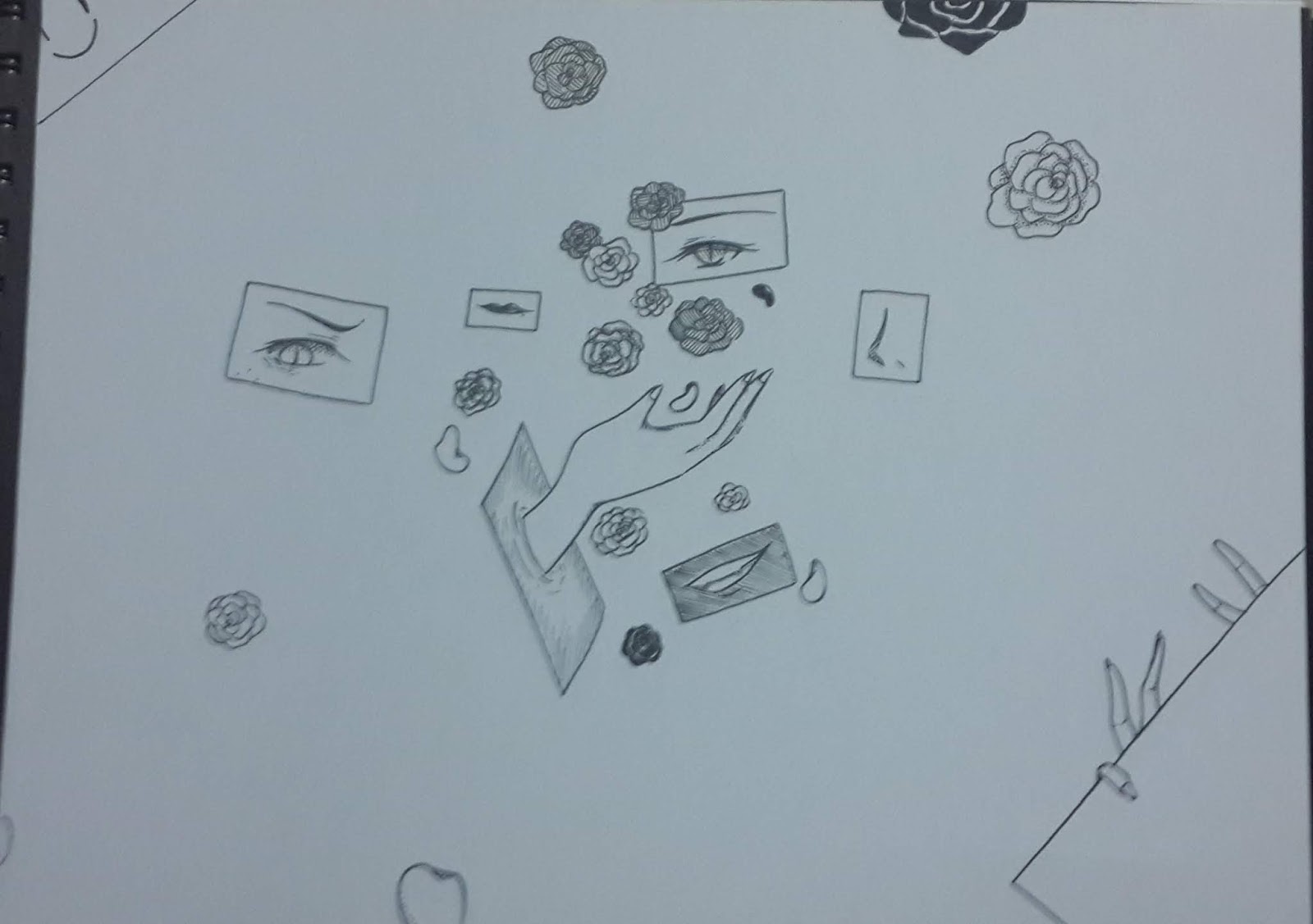
After that, I sketched some idea on paper.
 |
| Sketch about smoking |
 |
| Sketch about (parenting) eyes on children |
 |
| Sketch about how's factory and forest fire cause pollution |
Feedback: Ms. Sherry kinda understand the first one more, it looked from how the people smoke and took effects on it's body.
I sketched the most important part which are affected by smoking. I chose skin cancer, lung cancer, heart disease, kidney cancer, pancreas cancer, discoloured fingers, stomach ulcer, burger's disease, psoriasis.
 |
| Sketch more detail about the smoking |
Feedback: Ms. Sherry said that from the hand and it's body, it looked like a woman. However, some organ of it didn't represent it. And maybe I could move it more beside so I can add words about smoking.
I chose to add some more like cataract, hearing loss, hair loss, and winkling.
 |
| Some process |
 |
| Final outcome of the final project |
Feedback: Ms. Sherry said that I did a great job of the organ there.
BONUS (ILHAM GALLERY)
So, we went to Ilham Gallery at week 7, and here are some photos that I took:


So, we went to Ilham Gallery at week 7, and here are some photos that I took:
 |
| Imago (1968) |
 |
| Daun (1,2,4,5) and Guar (3) (1968) |


Comments
Post a Comment